Energy drink design

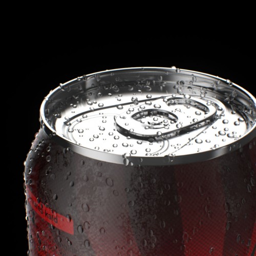
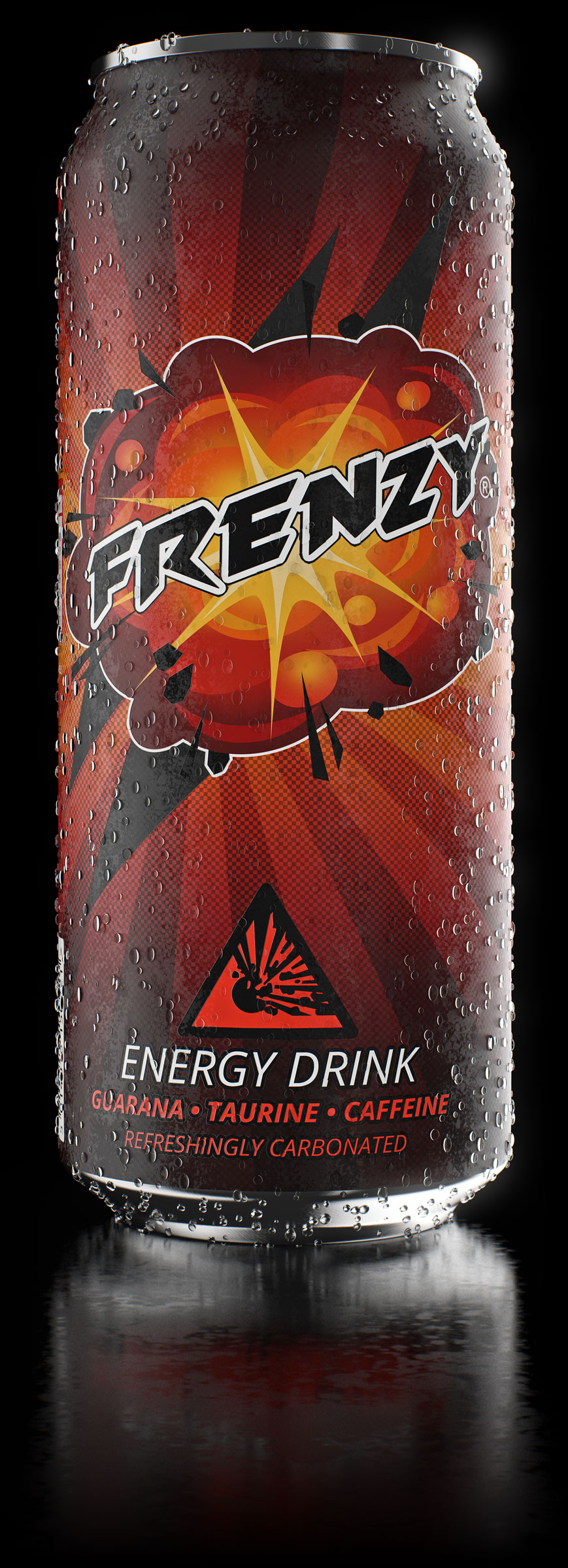
Product visualization for an energy drink I made for fun and practice. I wanted to see if I was able to create a nice-looking design for a beverage of some sorts, and make a professional looking product visualization of it. Energy drink cans seemed like a pretty good “canvans” for this exercise, as they are usually taller than “normal” soda cans, and in my opinion more aesthetically pleasing.
Concept

I went through a small product design process in the beginning. Starting by figuring out what kind of energy drink I wanted to have. I wanted one that screamed “energy” in every possible way, and would make the consumers want to buy it. So I looked at different parts of nature and physics revolving around energy, and found a bunch of good ideas. However, a lot of existing products had already “claimed” those ideas, so I chose one that hadn’t already been developed. So my concept revolved around explosions and the name “Frenzy”.

"Frenzy - a state or period of uncontrolled excitement or wild behaviour"

Label design

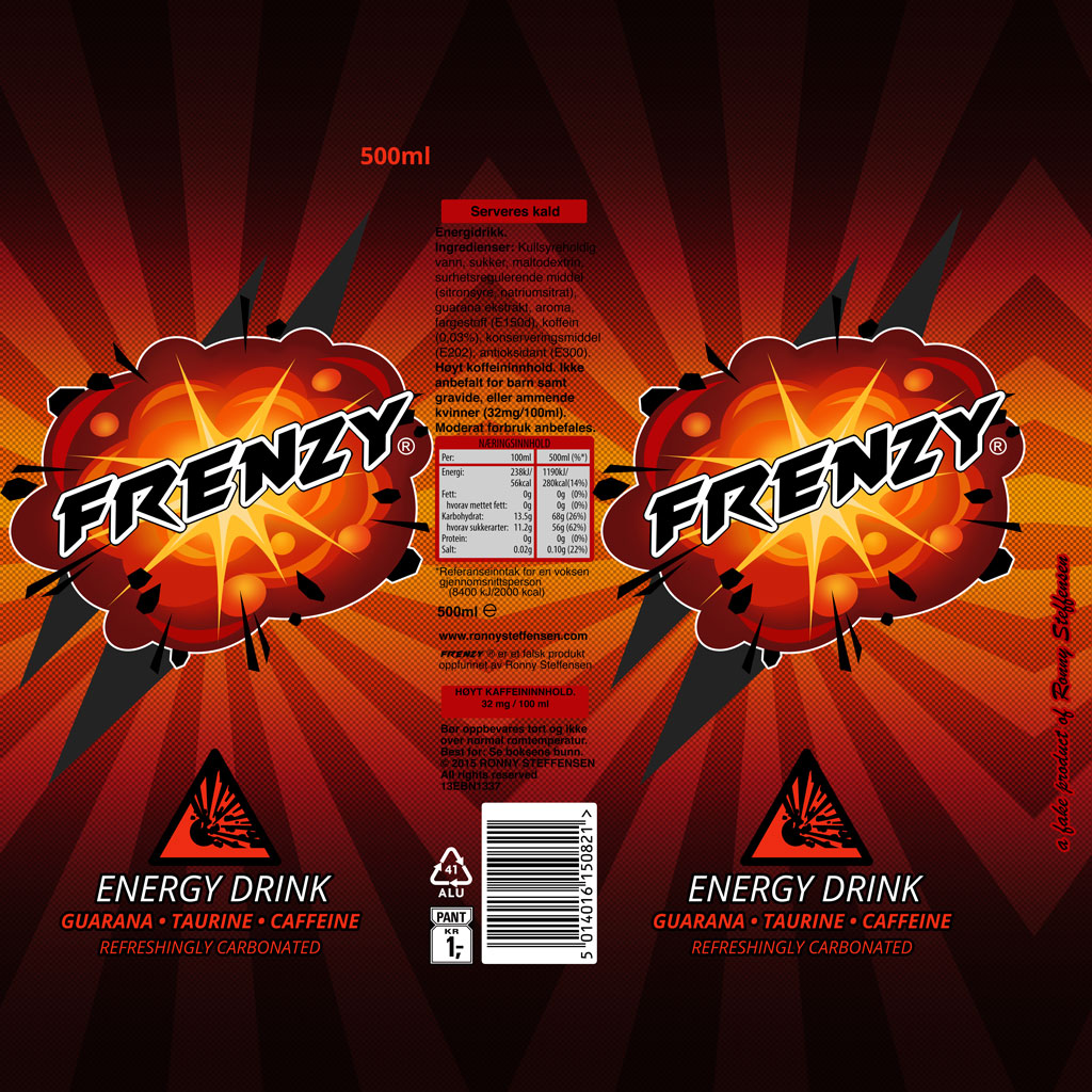
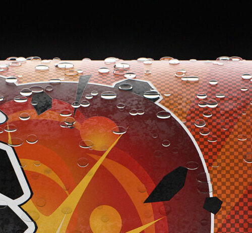
Creating the label for the can was a very fun process. I had a very clear idea for the look of it so most of the work was actually spent on getting the right dimensions and position of the various elements. I also put a lot of work into the colors and composition of the label to get it to look interesting and appealing. The finished label is an 8K texture that wraps seamlessly around the can.

Visualization

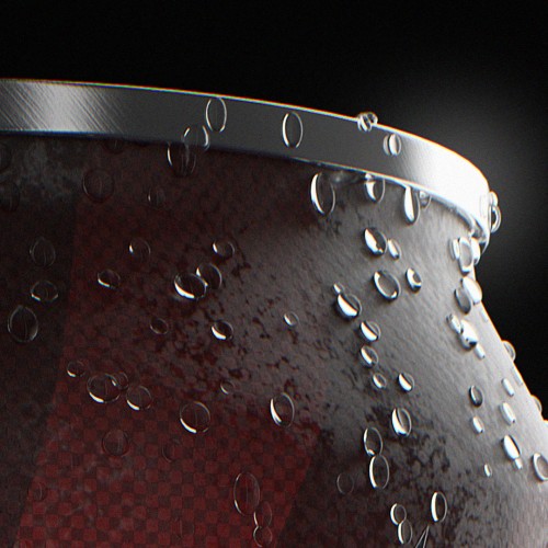
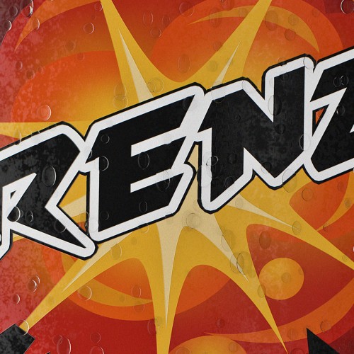
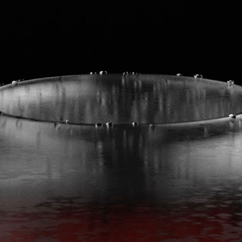
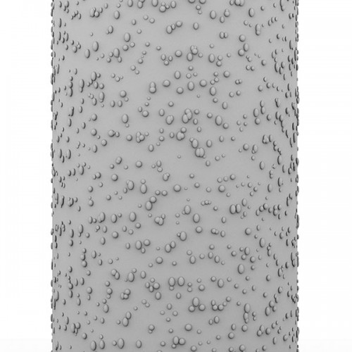
The visualization work was pretty straight forward. I wanted a very clean, minimalistic look to the finished image and I wanted it to look as real as possible. I spent a lot of time balancing the lighting and reflections to look the way I wanted. To get the energy drink to look awesome and refreshing it had to be cold. Droplets and variations in the glossy reflections created the look of dew/condensation on the outside of the can.